Project 1: Principal of Design Poster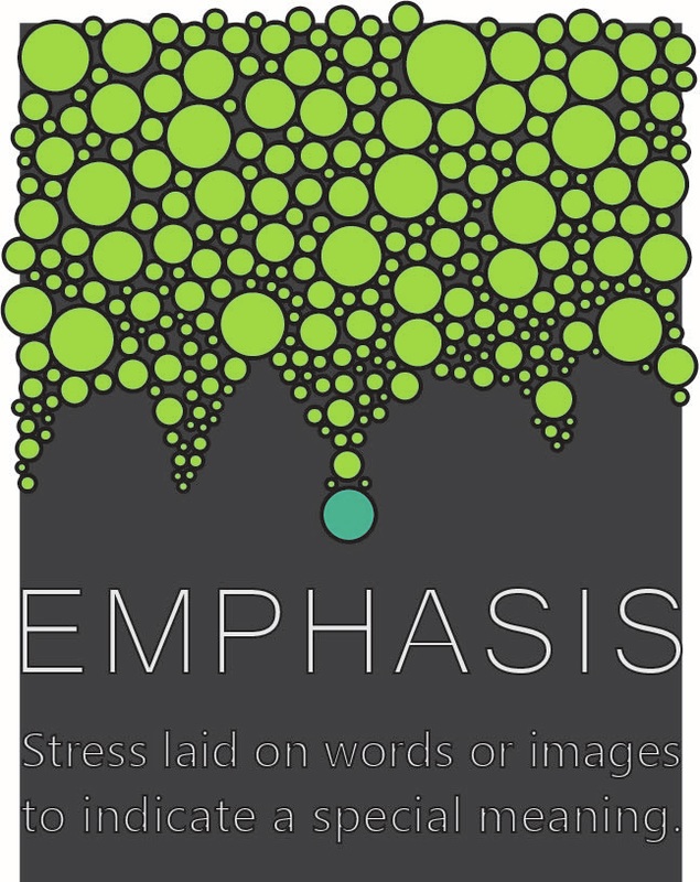
Project 2: Typography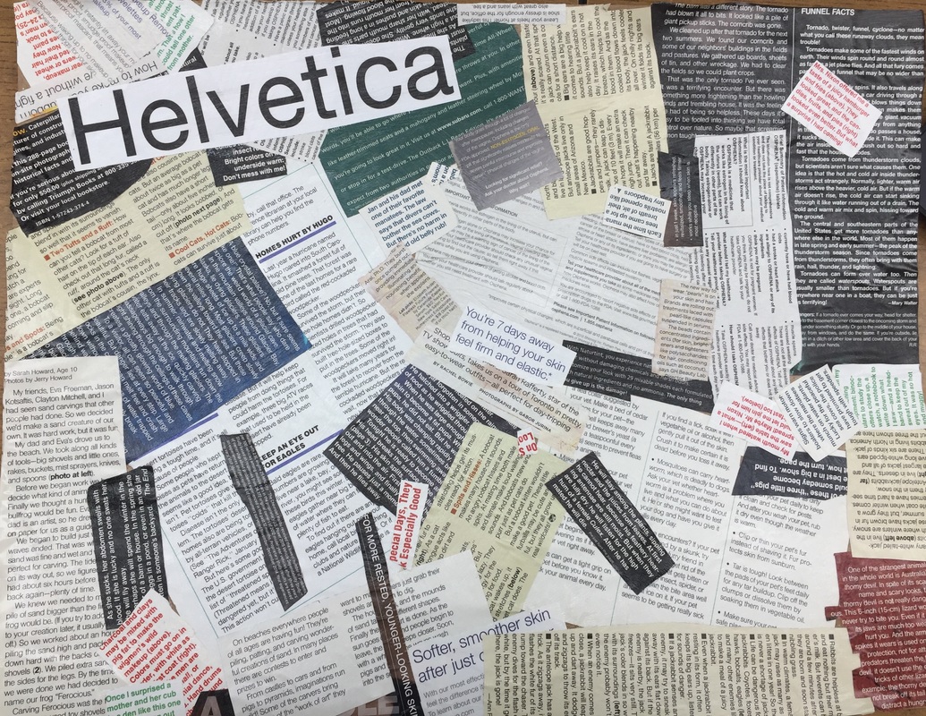
PROJECT 3 : Logo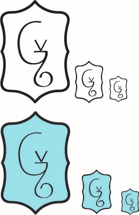
Project 4 : Infographic |
Materials: Adobe Illustrator
Year: 2016 Graphic Design The principal I got was Emphasis. To represent Emphasis I made one circle a different color so that it is different and it looks like it has a special meaning. I decided to make the things that hand down because it leads your eye down to the words. I used phi as a layout, because I like the look of more art and less words. I also emphasized the main word Emphasis because that is what the whole poster is about.
Materials: chipboard, magazines
Year: 2016 Graphic Design For my typography piece I decided to make a collage of Helvetica. I wanted to convey the message about how much Helvetica is used and how common it is to see in magazine and advertisements. All I had to do was go through about four magazines to get this much Helvetica.
Materials: Adobe Illustrator
Year: 2016 Graphic Design I decided to do a logo based on a career I want to pursue in the future. I named it Victoria's Graphics. I wanted to do something simple, but not to simple. Also the logo had to be sophisticated and legible in all sizes. I went with a pale blue because I didn't want a color that was to strong and overpowering, but a color that would show off the logo and not cover it up.
Materials: Adobe Illustrator
Year: 2016 Graphic Design For my infographic I decided to do the subject of how sleep effects teenagers. I was lucky and was able to find a website with all of the information that I wanted. I wanted the infographic to look sleek and modern and I think that I achieved that. Certain aspects of it I really like and I think turned out great other things I wish turned out better, but I think that it is pretty okay for the first infographic I made. I also learned a lot of things that I didn't know before about how important sleeping is. |
